
Case Study: Why Simple & Normal Are The Best
Internet is a great place! There are countless websites, hence you can find everything you need, and anyone can spend hours without getting bored and the possibilities are unlimited: you can learn a foreign language, a new trade, may consult blogs and online magazines, have some “online” fun with friends etc. All these are possible due to the amazing number of websites. Thinking from the perspective of a website owner the situation is completely different: how to get noticed by Internet users when your online presence is a small drop in a huge ocean? Yes, there is a real challenge to get barely few visitors. This difficult job is reserved for the SEO (Search Engine Optimization) specialists, but also a skilled web designer may have a substantial contribution. The quality and the originality of a layout are the main factors in the equation of the success and they can’t be ignored.
Many web designers created layouts that really stand apart, some contain huge headers, others use many and/or powerful colors, rare fonts, unused alignment etc., all these only to be different. What do you think, is it OK to try with all the means to be different? Is Internet such a crowded place that the simple, normal, intuitive design has no room to live?
My answer is categorically, there isn’t any doubt to normality, and then, in high quality presented, normality will linger for a long time. A “good” website is timeless; we shouldn’t forget that a website has as the main scope the information availability of its visitors and secondary to delight with amazing headers or to annoy them with obtrusive flash banners.
How do I see a professionally made website?
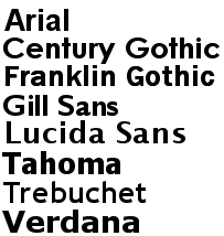
- Two fonts are enough and can do wonders
Because nobody is perfect I don’t have any moral power to offer you bad examples but believe me, there are websites that offer for each new construction or idea a new font. The idea of consistency is an “old concept”, the visitors need to be merely stimulated and aimed to read everything. Unfortunately, too many stimuli are as bad as the lack of them. Two fonts are, quite probably, fewer than needed, it dependents on the size of the project but surely, a good website can be build using two fonts: one used in headings, subheadings, usually not very common and the second for the effective written content of it. Instead of using multiple fonts sometimes, it is better to use various sizes of the existent font, this could aim much to realize a clear hierarchy. Isn’t it?
- Few colors, few chances to make mistakes
This post is based on web-designers’, as well as my own, experience, but there isn’t any fix idea, so don’t be upset if your perspective is different. The use of proper color scheme is a never-ending discussion amongst specialists,however my personal point of view is that using fewer colors means few chances of making mistakes.Using multiple colors, truly, is a piece of resistance in creating a strong contrast, very useful but it could be obtained by using various nuances of a single main color. Using a limited number of colors is easy for the eyes of the reader, which is really important. If you really care about contrast, and use more colors for this there is a little trick (learnt from Gomediazine): de-saturate your files and study the variants you created: a good contrast is obtained with the smart use of a single color while some color combinations may have less powerful effect as expected. You should make a difference between contrast (useful) and tension (not easy to the eyes).
- Alignment and hierarchy
It’s really important to create a hierarchy in any website, in this way the user distinguishes what is capital and what is peripheral content. This distinction is realized also with the alignment of the paragraphs.A point of advice here,don’t create various spaces for each idea. I personally agree with the idea of crafting a pattern for each type of alignment, i.e. the main subtitle must have x pixel left from the sidebar, the subtitles, m pixels and each new paragraph n pixels; avoid the overuse of new paragraphs, one confuses the readers more, rather than helping them with multiple white spaces.
- White space is vital
An agglomerated layout, full of text and images is boring and makes any visitors run away. The common mistake of an amateur is to “occupy” all the area of layout with content, icons, navigational menu etc., but this is totally wrong! White space is as important as the written content. My idea is that you shouldn’t make a layout have 30% or 40% white space, you must create it in order to let any visitors enjoy the time spend on the website. It must be usable and easy at hand to find any information and once all these are realized the design is ready. The stereotypes aren’t necessary; let your imagination and esthetic feeling work the magic.
- The overuse of icons and navigational menus
![]() Many designers want to avoid the boredom by using eye-catching icons that should distress the visitors. I am a big fan of original icons, yet their over usage can be considered a childish treatment. Don’t make complicated navigational menus and use icons for links. Try to be natural, use an icon when it is required, and the navigational menu is to make people access what they need: nobody dies by clicking twice until the source. (But two or three clicks, then you’re walking on dangerous grounds!)
Many designers want to avoid the boredom by using eye-catching icons that should distress the visitors. I am a big fan of original icons, yet their over usage can be considered a childish treatment. Don’t make complicated navigational menus and use icons for links. Try to be natural, use an icon when it is required, and the navigational menu is to make people access what they need: nobody dies by clicking twice until the source. (But two or three clicks, then you’re walking on dangerous grounds!)
- People just scan the websites!
Another advantage of having simple and “normal” layout is because the ordinary visitors aren’t web design specialists and they have preconceived ideas about websites formed across the time from scanning other websites. Once you disturb their opinion it is considered wrong and it is possible to leave the website for other options. The common behavior of visitors is a huge reason to not be very different.
In the end I ask for each one’s opinion, it will be helpful for anyone to have shared here lots of thoughts. Use the comment form and let me know what you think about common and atypical websites, built only to be different.


I missed it, due to the fundraising. It was my dream episode.